Cinematic photo filter: make a photo look like a film still
The short answer: a photo looks cinematic when its colour is separated rather than accurate, its contrast is shaped rather than even, its light appears to come from somewhere in the scene, and its frame looks composed rather than caught. Most "cinematic" filters only do the colour part, which is why they look like a preset instead of a film. Pose AI's Directors and Lighting families change all four.
The four things that make an image read as film
1. Colour separation, not colour accuracy
A phone tries to render colour correctly. A film tries to render it legibly — pushing shadows one way and highlights another so the eye can instantly tell foreground from background, warm from cold, safe from unsafe. That deliberate wrongness is most of what people are responding to.
2. Shaped contrast
Modern phone processing lifts shadows and recovers highlights, producing an evenly-legible image. Cinema does the opposite: it lets things fall to black, lets a window blow out, and uses the resulting range as composition. Detail everywhere is the most un-cinematic quality an image can have.
3. Motivated light
In a film still you can usually name the source — the window, the neon sign, the lamp, the headlights. The light has a reason and a direction. Flat ambient light from nowhere is the visual signature of a snapshot.
4. Framing that looks decided
Centred symmetry, or a deliberate one-point perspective, or a subject placed with real space around them. It reads as a choice, and choices read as cinema.
Why teal-and-orange presets don't get you there
A colour preset applies the same curve to every photo regardless of what's in it. It can't decide that the lamp is the motivated source, or that the shadow under the window should go to black while the face stays lit. It shifts hue and leaves the structure of the image exactly as ordinary as it was.
A model that can see the photo can do the other three. That's the whole difference.
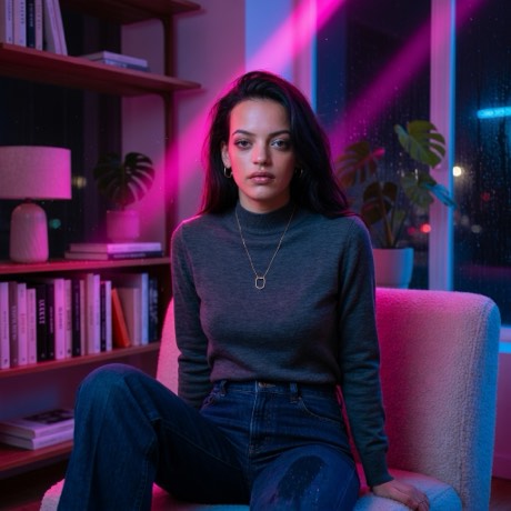
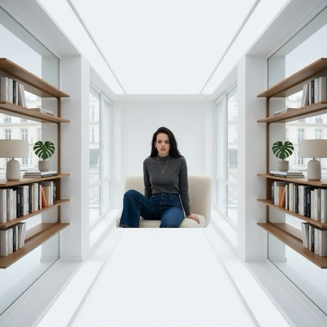
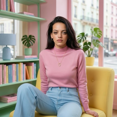
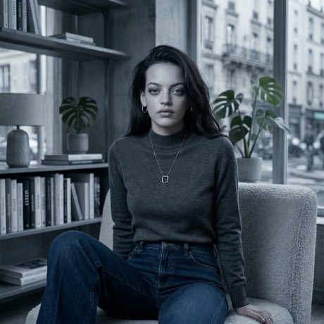
How to get the look
- Download the app — Pose AI, free on the App Store.
- Take the photo, or bring one in. Shoot straight from the app's camera, or pull in something already on your camera roll. Nothing leaves your phone until you pick a look.
- Open Directors or Lighting. Directors carries the palette-and-framing looks — Grand Hotel, One Point, Crooked, Copacabana, Bright Dread, Grindhouse, Cold Steel. Lighting is the subtler set: Golden Hour, Blue Hour, Film Noir, Cross Process, Neon Rain, Midnight Drive.
- Use Restyle for the Lighting family. Those change only colour and light, so your pose, room and clothing stay exactly as shot — which is usually what you want from a cinematic grade.
- Give it about twenty seconds and compare against the original before you decide.
Shoot for it, and the filter does more
The look lands much harder when the photo already has something to grade:
- Put a light source in the frame — a window, a lamp, a sign. It gives the grade something to motivate.
- Shoot with directional light, not overhead ambient. Side light produces the falloff that shaped contrast needs.
- Leave space. Cinematic framing is generous; a tight crop has nothing to compose.
- Let something go dark. A photo that's evenly lit corner to corner has no range to work with.
Which look for which photo
Golden Hour and Blue Hour are the safest and suit almost anything with a window. Midnight Drive and Neon Rain want night and artificial light. Grand Hotel and One Point want a symmetrical or corridor-like composition to lean on. Cold Steel and Grindhouse are the most aggressive — strong on the right photo, heavy-handed on a gentle one.
Grade your photo like a film still
Seven director palettes and ten lighting looks, all on your own photo.
Download on theApp StoreFree to download · iPhone · iOS 17+