Why old photos look old (it isn’t the clothes)
The short version: what dates a photograph is mostly the medium, not the outfit. The film’s colour, the grain, the softness of the lens, the kind of light the camera needed, and decades of fading on a shelf all say “old” before anyone looks at the clothes. A model asked for a decade has learned it from photos as they survive today, fading included, which is why a convincing decade look names the film first and the costume second. Even then it gets things wrong: period clichés, stray modern details, and your own modern grooming, which comes along with your likeness.
Put on a real 1950s dress and take a selfie in good light on a current phone. Nobody will think it’s from the fifties. They’ll think you went to a vintage shop. Now take a photo of someone in plain jeans and a white shirt, and print it on paper that has sat in a drawer for fifty years. Everyone reads that one as old.
The clothes are the weakest clue a photo gives about when it was taken. The medium is the strongest. That matters the moment you ask a model to make a photo look like it came from another decade, because the model has to fake the medium, and the medium includes things that happened long after the shutter closed.
What actually dates a photograph
Four things do most of the work, and none of them are fashion.
The film’s colour. Each era had its own materials, and each material saw colour differently. Everyday photography in the 1940s was mostly black and white. Colour slide film in the following decades could be rich and saturated, while cheaper print film was often muddier. A film stock has a signature the way a voice does, and people recognise it without being able to name it.
Grain and softness. Older film was slower and coarser, and most cameras people actually owned had modest lenses. Old snapshots are softer than we remember, with grain sitting in the shadows. A modern phone photo is sharp corner to corner and nearly noiseless, and that cleanliness is itself a date stamp.
The light. Slow film needed a lot of light. That pushed people outdoors into hard sun, or indoors under a flash that flattened faces and threw a shadow on the wall behind. The soft, low-light indoor photo that phones make easy barely existed for an ordinary family camera.
Time. This is the one people forget, and it gets its own section.
Half of the 1970s look happened after the 1970s
A colour print is made of dyes, and the dyes don’t age at the same rate. In many prints from the middle of the last century, the cyan and yellow layers faded faster than the magenta. The result is the drift everyone recognises: whites go cream, skin goes pink, the whole picture leans warm and orange, and the blacks lift into a milky haze.
So the warm, washed-out look people call “the seventies” is partly the seventies and partly forty-odd years in an album. Slides stored in the dark often held their colour much better, which is why a well-kept slide from the same years can look startlingly fresh, almost too modern to be real.
A model learned what each decade looks like from scans of photos that survived. It never saw the print the day it came back from the lab. So when you ask for a decade, you get the decade as it looks now: fading, colour cast and all. That is usually what you want, because it’s what “old” means to everyone looking at the result.
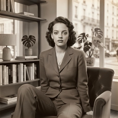
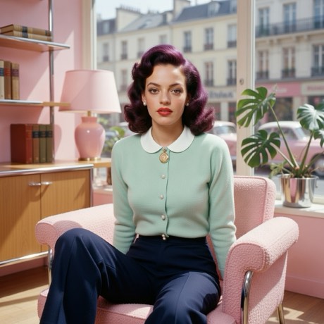
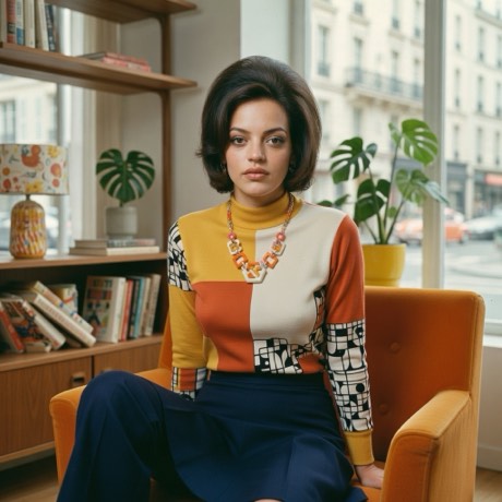
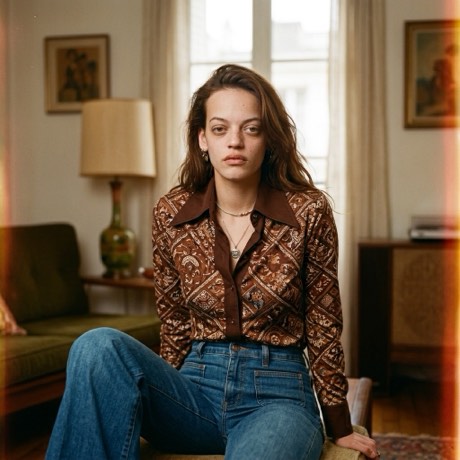
Same chair, four decades.
How the decade looks are written
Every look in the app is a short written brief rather than a set of slider values (what goes into one). The older decades are written medium first. The 40s look asks for warm monochrome, soft focus falloff and deep shadow. The 50s look asks for saturated Kodachrome colour and hard sunlight. The 60s look asks for faded Ektachrome with a slight green cast and flat, even light. The clothes and hair are in there too, but they come after the film.
To be straight about it, not every decade look in the app is built that way. The 70s and 80s lean much harder on costume and set, with a clean modern camera finish instead of a named film. The Reimagine versions go further, with wood panelling, shag carpet, roller skates and a boombox. Those come back reading more like a great theme party, or a well-dressed period film, than a print you found in a box. That’s fine if fun is the point. If you want something that could pass for a found photograph, the older, film-first looks get closer. The same logic is behind the noir look: the period is in the light, not the label.
Where a generated decade still goes wrong
It reaches for the cliché. A model’s idea of a decade is the average of its most photographed moments, so the fifties tend toward a diner and the seventies toward a house party. Real life in those years was mostly ordinary kitchens and bad weather, and those photos are underrepresented.
Modern details leak in. Glasses frames, a phone-shaped object on a table, an LED glow, very white teeth. Anything that the model doesn’t strongly tie to the period can slip through from the present.
Your face is from now. The look is told to keep your likeness, and likeness includes some of the things that date you: brow shape, makeup, a modern haircut that only half changes. That’s the trade for still looking like yourself, and it’s explained in what “it still looks like you” means. A total period makeover would be more convincing and less like you.
No signage. The looks rule out lettering, because generated text rarely spells anything. That removes one of the best period cues, the shop sign and the poster, on purpose.
Giving it a photo that can pass
Shoot with the light the era had: a hard sun outdoors, a flash at night, or one strong window. A photo lit like an old one restyles like an old one. Keep obviously modern things out of frame if you plan to use Restyle, since Restyle keeps your scene and everything in it (the two modes, explained). If your room is full of screens and you can’t move them, use a Reimagine look, which replaces the room. And skip the arm’s-length selfie. The high angle and wide, close lens of a held-out phone is a twenty-first-century composition, and no film stock disguises it. Hand the phone to someone, or prop it at eye height.
The usual limits still apply on top of all this. Hands, group shots and faces turned away are as hard in 1955 as they are now, and they’re covered in the photos none of these looks will save.
The short of it
A photo looks old because of what it was shot on, the light it needed, and what time did to it afterwards. Clothes are the last clue, not the first. Pick a decade look that names the film, give it a photo lit the way people lit photos then, and expect a few details from the present to come along for the ride.
Same you. Another decade.
Pick a decade, tap the shutter, keep the frame you like.
Download on theApp StoreFree to download · iPhone · iOS 17+